- The Three Resume Formats Explained
- Fonts: What Works and What Does Not
- Margins and Spacing
- Section Order: What Goes Where
- Single Column vs Two Column Layout
- Resume Length
- Resume Formatting Checklist
- Frequently Asked Questions
- Adapting Your Layout for Different Industries
- Digital Resume Formatting vs Print Formatting
- How to Format Your Contact Information Section
- How to Format Your Professional Summary
- Formatting Your Work Experience Section
- Formatting Your Education Section
- What Not to Include on a Resume
- Formatting Mistakes That Get Resumes Rejected
The content of your resume gets you the interview. The layout determines whether anyone reads it in the first place.
A recruiter scanning 50 resumes in an afternoon will spend about six seconds on each one before deciding to keep reading or move on. In those six seconds they are not reading your bullet points. They are reading the structure. Is this organized? Is it easy to navigate? Does it look professional?
This guide covers every formatting decision you need to make: layout type, fonts, margins, spacing, section order, and the rules that apply differently depending on whether a human or an ATS is reading your resume first.
The Three Resume Formats Explained
Before you touch a single font or margin setting, you need to choose your format. This is the most fundamental layout decision and getting it wrong wastes everything that comes after.
The Three Formats at a Glance
Reverse Chronological
Most recent job first, working backwards
Best for: Most job seekers with consistent work history. This is what recruiters expect. When in doubt use this one.
Functional (Skills-Based)
skills section leads, work history de-emphasized
Best for: Career changers or people with employment gaps. Use with caution as many recruiters are suspicious of this format.
Combination (Hybrid)
Strong skills section followed by chronological history
Best for: Senior professionals or career changers who still have relevant experience to show.
For the vast majority of people reading this guide, reverse chronological is the right choice. It is what recruiters expect, it is what ATS systems parse most reliably, and it clearly shows career progression.
Fonts: What Works and What Does Not
Font choice affects how professional your resume looks and whether ATS software can read it correctly. These are two separate but equally important concerns.
Best Fonts for a Resume
Safe Choices (Work for Every Industry)
Arial
Clean, highly readable, universally supported
Calibri
Modern, friendly, Microsoft default
Garamond
Elegant, slightly more character, great for traditional industries
Georgia
Warm, readable, works well for body text
Fonts to Avoid
Comic Sans, Papyrus, any script or handwriting font, any display font designed for headlines. These signal a lack of professional judgment and some fail to render in ATS systems correctly.
Font Size Rules
- Your name: 18 to 24pt. Large enough to anchor the page visually.
- Section headings: 13 to 16pt, bold.
- Body text and bullet points: 10 to 12pt. Never go below 10pt.
- Contact details: 10 to 11pt.
Stick to one font throughout. Use bold and size variations to create hierarchy. Using two or more fonts rarely improves a resume and often makes it look inconsistent.
Margins and Spacing
Margins and spacing are the invisible architecture of your resume. Get them wrong and even great content looks cluttered or oddly sparse.
Margins
Set all margins to one inch. This is the standard and it works. If you are genuinely struggling to fit everything on one page you can reduce to 0.75 inches but no smaller. Going below 0.5 inches makes the page feel suffocating and some ATS systems clip content near the edges.
Line Spacing
Use 1.0 or 1.15 line spacing for body text. Single spacing is tight but readable. Anything above 1.5 looks like you are padding out a thin resume and wastes valuable space.
Space Between Sections
Add 8 to 12pt of space after each section heading and before the next one begins. This creates visual breathing room without wasting too much page space. Consistent spacing between sections makes the document feel organized even before a word is read.
Quick Rule
If your resume looks too dense, the problem is usually insufficient spacing between sections, not that you need a smaller font. Add space before fixing text size.
Section Order: What Goes Where
The order of your sections signals to recruiters what you want them to prioritize. Most experienced professionals use this order:
- Contact information, always first, always at the top
- Professional summary, your opening argument
- Work experience, your strongest section in most cases
- Skills, keyword-rich, scannable
- Education, drops lower as you gain experience
- Certifications, if relevant
- Projects, awards, or volunteer work, optional, at the bottom
Exception for recent graduates: If you have limited work experience, move Education to position two, right after your summary. Your degree is your strongest credential at this stage and it should be prominent.
Single Column vs Two Column Layout
This is one of the most debated resume questions and the answer depends entirely on how you are submitting your application.
Single Column
- ATS reads it perfectly every time
- Clean and easy to scan
- Works for every industry
- Safe default for all online applications
Two Column
- ATS often misreads or scrambles content
- Can look impressive to humans
- Fine for in-person or direct email only
- Never use for online applications
The safest rule: use a single column layout for any resume submitted through an online portal or job board. Reserve two-column designs for situations where you know a human will open it first.
Resume Length
The one-page rule is real but it has nuance.
How Long Should Your Resume Be?
One page. No exceptions. You do not have enough experience to justify two pages and anything that gets cut is probably not essential.
One to two pages. Two pages is fine if every line earns its place. Do not stretch to fill two pages if one is sufficient.
Two pages maximum for most roles. Three pages only for academic CVs or C-suite positions with extensive board and publication histories.
If you are forcing a two-page resume into one by reducing the font to 9pt and shrinking margins to 0.4 inches, the two-page version is better. Legibility always wins over hitting a page target.
Resume Formatting Checklist
Before you submit any resume, run through this list:
- Single font used throughout, 10 to 12pt for body text
- Name is larger than everything else on the page
- One-inch margins on all sides (minimum 0.75 inches)
- Consistent spacing between all sections
- Standard section headings: Summary, Work Experience, Skills, Education
- Single column layout for online submissions
- No graphics, icons, photos, or text boxes
- Bullet points use standard round bullets only
- Saved as .docx for online applications
- File named FirstName-LastName-Resume.docx
- Fits on one page (under 5 years) or two pages maximum
- Consistent date formatting throughout (Month Year or MM/YYYY)
For a complete guide to writing every section of your resume including work experience bullet points, skills sections, and professional summaries, see our full resume writing guide.
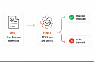
To understand exactly how ATS software reads your resume and what formatting mistakes get you filtered out automatically, read our ATS resume optimization guide.
Frequently Asked Questions
What is the best resume format in 2026?
Reverse chronological for most people. It is what recruiters expect, what ATS reads most reliably, and it presents your career story in the clearest possible way. Only switch to functional or combination formats if you have a specific reason such as a major career change or significant employment gaps.
Should I use a resume template?
Yes, a good template saves time and ensures consistent formatting. But be careful which template you choose. Many popular templates from Canva and design sites use columns, tables, and graphics that fail ATS parsing. Use a simple Word-based template for online applications.
What font size is too small for a resume?
Anything below 10pt is too small. At 9pt your resume becomes genuinely difficult to read on screen and impossible to skim quickly. If you are going below 10pt to fit everything on one page, cut content instead.
Should I use color on my resume?
A subtle accent color is fine and can add visual interest. Stick to one color used sparingly for section headings or your name. Avoid color backgrounds behind text, heavy color blocks, and anything that reduces contrast. Always check that your resume prints cleanly in black and white.
Download one of our free ATS-friendly resume templates built with all of these formatting rules already applied.
Adapting Your Layout for Different Industries
The formatting rules in this guide apply broadly but different industries do have different norms worth knowing before you submit.
Corporate and Finance
Strictly traditional. Black text on white, serif or clean sans-serif font, no color, single column, reverse chronological. Any deviation from conservative formatting in finance or law signals a misunderstanding of professional norms in those fields. Your content needs to carry the resume because the design cannot.
Technology and Startups
Clean and modern layouts are well-received. A subtle accent color is fine. Single column is still strongly preferred for ATS reasons but slightly more visual hierarchy through font sizing and spacing is acceptable. What technology hiring cares about most is your skills section and whether you have specific tools and programming languages clearly listed.
Creative Industries
Design, advertising, and creative agencies give you more latitude on visual presentation. A designed PDF version is appropriate for direct applications. Just remember the two-version rule: a clean Word version for online portals, a designed PDF for direct outreach. Many creative directors appreciate candidates who bring a printout of their designed resume to an interview.
Healthcare and Clinical
Conservative and clear. Healthcare administrators reading resumes care about certifications, licenses, and clinical experience. Keep the layout extremely clean and make credentials easy to find quickly. A dedicated certifications section near the top is more important here than in most other fields.
Academic and Research
Academic CVs operate by different rules than professional resumes. There is no page limit on an academic CV. Publications, presentations, grants, and research experience all warrant their own sections. Formatting is conservative but thoroughness matters more than brevity. If you are applying for academic positions, an academic CV is a different document type from a professional resume and should be treated as such.
Digital Resume Formatting vs Print Formatting
Most resumes are viewed on screens now, not printed. This changes a few formatting considerations that most resume guides do not address:
Hyperlinks: In a digital resume, your contact email, LinkedIn URL, and portfolio link should be live hyperlinks. In Word and Google Docs, URLs are automatically hyperlinked. Make sure they work before you submit. In a printed resume, write out the full URL so it can be typed manually.
Color contrast on screen: What looks like a subtle light grey section heading on your monitor may be nearly invisible on a different screen or projector. Test your resume on at least two different screens before submitting. Any text color you use for headings should have a contrast ratio that remains readable on low-brightness screens.
File size: A simple text-based Word resume should be a very small file. If your resume file is over 1MB it likely contains embedded images or graphics that could cause display problems. Keep it lean.
Scrolling on mobile: Some recruiters review resumes on phones. A single column layout scrolls naturally on a small screen. A two-column layout can require horizontal scrolling and becomes frustrating to read on mobile. Another reason single column wins for digital submissions.
How to Format Your Contact Information Section
The contact section is the most read part of your resume yet it gets the least attention. Every recruiter who wants to call you back starts here. Get it wrong and you waste everything else on the page.
Your name goes at the very top in the largest font on the document, 18 to 22pt, bold. Below it on one or two lines, add your contact details separated by a vertical bar or bullet:
Sarah Chen
Chicago, IL | sarah.chen@gmail.com | (312) 555-0142 | linkedin.com/in/sarahchen
What to include: city and state (not full address), personal email, phone number, LinkedIn URL, and portfolio or personal website if you have one. What to leave out: photos, date of birth, marital status, and full street address. None of these help your application and some can introduce unconscious bias before you get a chance to interview.
One common mistake: putting your contact information inside a document header in Word or Google Docs. Headers look clean visually but many ATS systems skip the header entirely when parsing the document. Put your name and contact details in the main body text where ATS can always find them.
How to Format Your Professional Summary
Your summary sits directly below your contact information and it is where recruiters decide whether to keep reading. It needs to be three to five sentences, written in first person without the “I,” and focused entirely on the value you bring.
The structure that works best:
- Your job title and years of experience
- Your primary area of specialization or strongest credential
- One quantified achievement or specific outcome
- What you are looking for or what you bring to a new role
Generic Summary (Weak)
“Motivated professional with strong communication skills and a passion for delivering results. Team player who works well under pressure and is eager to contribute to a dynamic organization.”
Specific Summary (Strong)
“Operations manager with 7 years of experience streamlining manufacturing and supply chain processes for mid-size consumer goods companies. Reduced production costs by 18% over two years through process redesign and vendor renegotiation. Experienced in leading cross-functional teams of 20+ and implementing ERP systems across multiple facilities.”
Formatting Your Work Experience Section
Work experience is the core of most resumes and the section recruiters spend the most time on. The formatting here needs to be absolutely consistent because inconsistencies create the impression of sloppiness even when the content is strong.
For each job, include four elements in the same order every time:
- Job title (bold)
- Company name
- Location (City, State)
- Dates of employment (Month Year to Month Year)
Then your bullet points. Three to five bullets per role for recent positions, two to three for older ones. Each bullet starts with a strong action verb and ideally contains a number somewhere.
Date formatting consistency matters more than most people realize. Pick one format and use it throughout: either “January 2022 – March 2024” or “01/2022 – 03/2024” or “Jan 2022 – Mar 2024.” Never mix formats across different job entries on the same resume. It signals a lack of attention to detail.
Action Verbs to Start Your Bullets
Led, Managed, Built, Designed, Developed, Launched, Reduced, Increased, Streamlined, Negotiated, Implemented, Delivered, Coordinated, Spearheaded, Oversaw, Generated, Trained, Established, Transformed, Achieved
Formatting Your Education Section
Education formatting is straightforward but there are a few rules that trip people up.
List your most recent degree first. Include: degree type and major, institution name, graduation year. That is it for most people. GPA only if above 3.5 and you graduated in the last two years. Honors, dean’s list, and relevant academic awards are worth including within the first five years of your career.
One thing many people get wrong: listing graduation year as a range instead of just the end year. “2016 to 2020” takes up more space than “2020” and provides no additional value since employers only care when you completed the degree, not when you started.
Where education sits in the section order: after work experience for most professionals with two or more years of experience. Before work experience for recent graduates or those switching careers where their degree is their primary credential for the role.
What Not to Include on a Resume
Knowing what to leave off a resume is just as important as knowing what to include. These are the most common things that should not be on a modern resume:
- A photo, standard in some countries but avoided in the US, UK, Canada, and Australia where it can introduce bias claims
- The word “Resume” as a heading, it is obvious what the document is
- “References available upon request”, assumed, wastes valuable space
- Your full street address, city and state is sufficient
- Jobs from more than 15 years ago, unless they are directly relevant or you are in an executive role with a long career history worth showing
- High school education, once you have a college degree, high school disappears from the resume entirely
- Subjective personality claims, “passionate,” “hardworking,” “detail-oriented”, show these through your achievements, do not simply declare them
- Salary expectations, these are negotiated separately and have no place on a resume
Formatting Mistakes That Get Resumes Rejected
Most Common Formatting Errors
Inconsistent formatting across sections
One section uses bold headings, another uses underlines, dates formatted differently in each role. This signals carelessness immediately.
Using tables or text boxes for layout
Tables and text boxes look structured visually but most ATS systems cannot parse them correctly. Content gets scrambled or skipped entirely.
Tiny font to cram content onto one page
9pt text is genuinely hard to read. If your content needs two pages, use two pages. Forcing everything onto one page at the cost of readability is the wrong trade-off.
No white space between sections
A resume with no breathing room between sections looks like a wall of text. Recruiters skim first. If your resume is not skimmable in six seconds it will not get read in full.